
Is the page design on this site broken for anyone else? (Ubuntu w/ Chrome and Firefox, Android with Chrome)

Haven't seen a question regarding this issue (apologies if I missed it). Since a few days, the default page view on ROS Answers looks broken for me on my Ubuntu 12.04 machine using both Chrome and Firefox. Each Q/A spans many rows, the icons and text in the top right are overlaid over each other and the input mask I'm using right now is only half as wide as it's supposed to be.
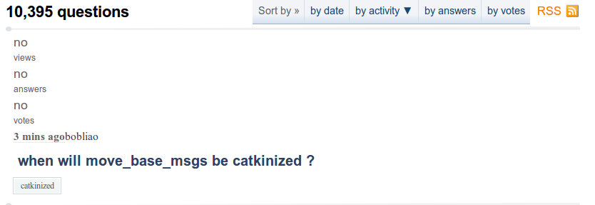
Example of Q/A spanning many rows:
A few days before getting messed up on my Ubuntu machine the website already started looking strange on Android 4.2/Chrome (if it happens to you, you'll know what I mean ;) ).
Is this happening to anyone else? Gazebo Answers continues to look normal on all devices. I suppose it could be some sort of screw-up of Chrome and saving settings across devices. Then again, Firefox shouldn't be affected.


It works for me.