ROS Resources: Documentation | Support | Discussion Forum | Index | Service Status | ros @ Robotics Stack Exchange
Ask Your Question
1

Why the visualization interface of waymo/uber/cruise looks so similar?

asked 2019-02-19 19:02:24 -0600

Honghao Tan gravatar image

updated 2019-02-20 07:45:03 -0600

lucasw gravatar image

I can't help noticing that those interface are similar to each other. Are they all using the same toolchain?

For instance, this photo shows video captured by a Google self-driving car coupled with the same street scene as the data is visualized by the car during a presentation at a media preview of Google's prototype autonomous vehicles in Moutain View, California. Credit: Elijah Nouvelage/Reuters Google interface

image description

Another example, it is the interface of unknown company (maybe uber?) image description
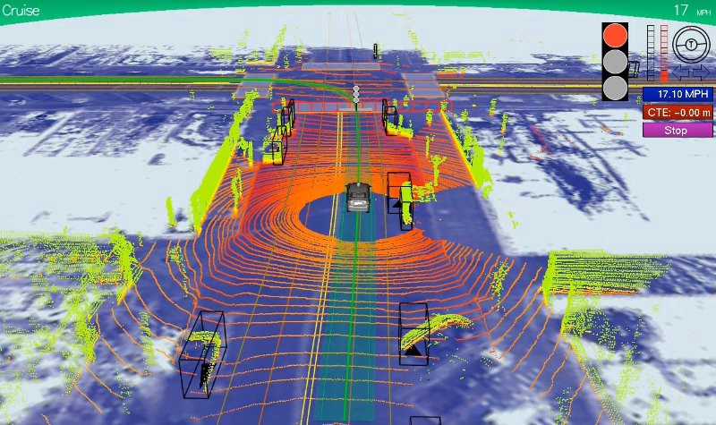
image description

And doing research on ROS shows that a popular visualization tool in ROS community is RViz. Maybe it is either RViz or Director for final visualization. Is there any connection between uber/google interface with Rviz or ROS partners?

edit retag flag offensive close merge delete

1 Answer

Sort by ยป oldest newest most voted
3

answered 2019-02-20 17:23:37 -0600

Geoff gravatar image

I can't speak for whether Google or Uber are using rviz in any way, although I suspect Uber is not because they have their own tool for visualisation of data.

I don't think they look that similar. But there obviously similarities in how the information is displayed. This is because they are showing much of the same information. Some examples:

  • You want to show the positions of detected vehicles and be able to instantly understand their orientation and maximum extents. A bounding box is ideal for this because it is simple to understand. Adding an arrow makes it clear which way is the front.
  • Similarly other dynamic obstacles, such as bikes and people, are also usually shown as bounding boxes. Often a different colour is used based on the object classification.
  • The path the car plans to follow, and possibly has followed, is usually represented as a line, just like you see for any mobile robot.
  • The available space for navigating is a corridor that varies in width based on things like lane width and what is at the side or encroaching on the lane. Hence it is often displayed as a stripe. Although I've seen one, I think it was Cruise, that showed it as a series of lines perpendicular to the path. I actually found that easier to visualise the changing usable width than a stripe.
  • Point cloud data from a sensor like a Velodyne has a distinctive look, because the scans come in as rings and these rings appear to get further apart as the distance from the car grows. The colouring is also often the same, with more urgent colours used for points closer to the car to make it clear where things are relative to the car.
edit flag offensive delete link more

Comments

All on point, a second mention is that nearly all those people come from pretty much the same background, so many of the elements are similar because there's no point in changing what you know if it works as well as anything else. For autonomous driving Rviz would likely be more of a harm than help.

stevemacenski gravatar image stevemacenski  ( 2019-02-20 17:44:49 -0600 )edit

Since they all came from the small circle, it makes more sense that they will use a similar tool for visualization so that they can focus their attention on other daunting tasks.

Honghao Tan gravatar image Honghao Tan  ( 2019-02-20 17:58:47 -0600 )edit

Question Tools

3 followers

Stats

Asked: 2019-02-19 19:02:24 -0600

Seen: 1,225 times

Last updated: Feb 20 '19