The site is read-only. Please transition to use Robotics Stack Exchange
| ROS Resources: Documentation | Support | Discussion Forum | Index | Service Status | ros @ Robotics Stack Exchange |

| | 1 | initial version |
Hi. For those who face the similar problem as me, you may have a look at here.
I just decided to visualize my sensor value by using Costmap_2D. The reason I decided to do so is due to this post. It does explain the differences between costmap_2D and Occupancy Grid clearly. Both are actually using Occupancy Grid concept and their main difference is one is ROS message and the other is a ROS module. Hopefully, by using ROS module, everything will be easier.
Beside that, based on costmap_2D's Wiki, they do mentioned:
The costmap uses sensor data and information from the static map to store and update information about obstacles in the world through the costmap_2d::Costmap2DROS object.
Therefore, I would like to give this a try. If I manage to implement it, I will reupdate here.
| | 2 | No.2 Revision |
Hi. For those who face the I have solved this problem with two possible methods. One is by using pointcloud2 and the second is by using visualizer msgs : marker. Images below show my desired goal and solutions obtained by using pointcloud2 and marker.
The left image is generated by using matplotlib while the center is by using PointCloud2 and right is by using marker. There is not obvious different between PointCloud2 and Marker from the aspect of display. I cant generate the exact similar problem image as me, you may have a look at here.
I just decided to visualize my sensor value by using Costmap_2D. The reason I decided to do so is matplotlib (the yellow region) due to this post. It my lack of knowledge. Recommendation and suggestion on how to achieve that is very welcome. Back to the topic. Although PC2 and marker version does explain the differences between costmap_2D and Occupancy Grid clearly. Both are actually using Occupancy Grid concept and their main difference is one is ROS message and the other is a ROS module. Hopefully, by using ROS module, everything will be easier.not have the yellowish region as matplotlib, however it has slightly lighter region at the similar location is satisfy for me. I have attached part of my codes for PC2 and Marker at here as references for beginner like me.
Beside that, based on costmap_2D's Wiki, they do mentioned:For PointCloud2 :
# PointCloud2 is working
# PointCloud2 : The following part is to gdm_data X, Y and mean/var
gdm_X = X.flatten()
gdm_Y = Y.flatten()
gdm_Z = numpy.zeros_like(gdm_X)
gdm_Mean = mean_map.flatten()
gdm_data = numpy.column_stack((gdm_X,gdm_Y,gdm_Z,gdm_Mean))
# PointCloud2 : The following algo is for visualize pointcloud2
header = std_msgs.msg.Header()
header.stamp = rospy.Time.now()
header.frame_id = 'map'
field=[PointField(name='x', offset=0, datatype=PointField.FLOAT32, count=1),PointField(name='y', offset=4, datatype=PointField.FLOAT32, count=1),PointField(name='z', offset=8, datatype=PointField.FLOAT32, count=1),PointField(name='rgb', offset=12, datatype=PointField.UINT32, count=1)]
gdm_data = pcl2.create_cloud(header, field, gdm_data)
pc2_Testing.publish(gdm_data)
The costmap uses sensor data and information from the static map to store and update information about obstacles For Marker :
# MarkerArray is Working
gdm_X = X.flatten()
gdm_Y = Y.flatten()
gdm_Z = numpy.zeros_like(gdm_X)
gdm_Mean = mean_map.flatten()
gdm_Mean = numpy.interp(gdm_Mean,[min(gdm_Mean),max(gdm_Mean)],[0.0,1.0])
gdm_data = numpy.column_stack((gdm_X,gdm_Y,gdm_Z,gdm_Mean))
triplePoints = []
colorsGroup = []
markerArray = MarkerArray()
for (x,y,z,a) in the world through the costmap_2d::Costmap2DROS object.  Therefore, I would like to give this a try. If I manage to implement it, I will reupdate here. gdm_data:
    p = Point()
    p.x = x
    p.y = y
    p.z = 0
    marker = Marker()
    marker.header.frame_id = "/map"
    marker.type = marker.POINTS
    marker.action = marker.ADD
    marker.scale.x = 0.2
    marker.scale.y = 0.2
    marker.scale.z = 0.2
    colorsGroup.append(ColorRGBA(0,0,a,1))
    marker.pose.orientation.w = 1.0
    t = rospy.Duration()
    marker.lifetime = t
    triplePoints.append(p)
marker.points = triplePoints
marker.colors = colorsGroup
markerArray.markers.append(marker)
marker_pub.publish(markerArray)
| | 3 | No.3 Revision |
Hi. I have solved this problem with two possible methods. One is by using pointcloud2 and the second is by using visualizer msgs : marker. Images below show my desired goal and solutions obtained by using pointcloud2 and marker.
marker.
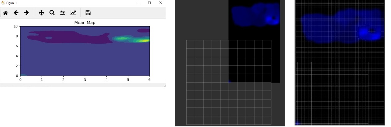 The left image is generated by using matplotlib while the center is by using PointCloud2 and right is by using marker. There is not obvious different between PointCloud2 and Marker from the aspect of display. I cant generate the exact similar image as matplotlib (the yellow region) due to my lack of knowledge. Recommendation and suggestion on how to achieve that is very welcome. Back to the topic. Although PC2 and marker version does not have the yellowish region as matplotlib, however it has slightly lighter region at the similar location is satisfy for me. I have attached part of my codes for PC2 and Marker at here as references for beginner like me.
For PointCloud2 :
# PointCloud2 is working
# PointCloud2 : The following part is to gdm_data X, Y and mean/var
gdm_X = X.flatten()
gdm_Y = Y.flatten()
gdm_Z = numpy.zeros_like(gdm_X)
gdm_Mean = mean_map.flatten()
gdm_data = numpy.column_stack((gdm_X,gdm_Y,gdm_Z,gdm_Mean))
# PointCloud2 : The following algo is for visualize pointcloud2
header = std_msgs.msg.Header()
header.stamp = rospy.Time.now()
header.frame_id = 'map'
field=[PointField(name='x', offset=0, datatype=PointField.FLOAT32, count=1),PointField(name='y', offset=4, datatype=PointField.FLOAT32, count=1),PointField(name='z', offset=8, datatype=PointField.FLOAT32, count=1),PointField(name='rgb', offset=12, datatype=PointField.UINT32, count=1)]
gdm_data = pcl2.create_cloud(header, field, gdm_data)
pc2_Testing.publish(gdm_data)
For Marker :
# MarkerArray is Working
gdm_X = X.flatten()
gdm_Y = Y.flatten()
gdm_Z = numpy.zeros_like(gdm_X)
gdm_Mean = mean_map.flatten()
gdm_Mean = numpy.interp(gdm_Mean,[min(gdm_Mean),max(gdm_Mean)],[0.0,1.0])
gdm_data = numpy.column_stack((gdm_X,gdm_Y,gdm_Z,gdm_Mean))
triplePoints = []
colorsGroup = []
markerArray = MarkerArray()
for (x,y,z,a) in gdm_data:
    p = Point()
    p.x = x
    p.y = y
    p.z = 0
    marker = Marker()
    marker.header.frame_id = "/map"
    marker.type = marker.POINTS
    marker.action = marker.ADD
    marker.scale.x = 0.2
    marker.scale.y = 0.2
    marker.scale.z = 0.2
    colorsGroup.append(ColorRGBA(0,0,a,1))
    marker.pose.orientation.w = 1.0
    t = rospy.Duration()
    marker.lifetime = t
    triplePoints.append(p)
marker.points = triplePoints
marker.colors = colorsGroup
markerArray.markers.append(marker)
marker_pub.publish(markerArray)
 ROS Answers is licensed under Creative Commons Attribution 3.0 Content on this site is licensed under a Creative Commons Attribution Share Alike 3.0 license.